Monitor specifications are not lies, but they are not answers either. A panel rated at 1ms can still smear in motion, a 1000:1 contrast ratio can look superb in one room and washed out in another, and two displays with identical numbers on the box can be visibly different in front of you.
This is a deep dive into what the declared parameters actually measure, where the measurement stops matching what you see, and where the limit stops being the display and becomes your own eyes. Some of the physics here has not changed since LCDs replaced CRTs; almost all of the hardware has.
What’s Inside
- 1 – Three Levels of Reading a Monitor Specification
- 2 – Response Time, Persistence and Why Fast Pixels Are Not Enough
- 3 – Input Lag: How It Is Measured and How Much It Matters
- 4 – Contrast Ratio: Static, Dynamic and the HDR Tiers That Replaced Them
- 5 – Color Reproduction: Gamut, Backlighting and Current Standards
- 6 – Color Temperature and Gray Balance
- 7 – Setting Up a Monitor and Your Workspace
- 8 – Final Thoughts on Reading Monitor Specifications
Three Levels of Reading a Monitor Specification
The first and shallowest question is whether the manufacturer is simply making numbers up. For established brands the answer is generally no. The figures are measured, and they are measured in a way the manufacturer can defend.
The second question is more useful: what does the declared parameter actually measure, and under what conditions? Response time is the classic case. It was originally defined in ISO 13406-2 as the total time for a panel to switch from black to white and back to black. A panel hits that number honestly, while a transition between two similar shades of gray — which is what real content is made of — can take considerably longer.
That standard is no longer even current. ISO withdrew ISO 13406-2 in November 2008, replacing it with ISO 9241-302, 303, 305 and 307. The measurement convention it established outlived it, which is why “response time” on a spec sheet still needs interpretation.
The third level is the interesting one: how the human visual system perceives the parameter at all. There is an analogy in audio. Valve amplifiers measure poorly — high harmonic distortion, mediocre pulse response — yet many listeners prefer them, not because the reproduction is more accurate but because the distortion happens to be pleasant. Perception and measurement are separate things.
Perception only becomes the limiting factor once the hardware is good enough for it to matter. When panels took tens of milliseconds to switch, there was no point discussing retinal persistence. Now that transitions are measured in fractions of a millisecond, the eye is frequently the slowest component in the chain.
Response Time, Persistence and Why Fast Pixels Are Not Enough
Old reviews predicted that once real response times fell to two to four milliseconds, motion blur would simply cease to be a topic. Response times have since fallen far below that, and motion blur is still a topic. The prediction was wrong because it identified the wrong bottleneck.
Why CRTs looked faster than their successors
Everyone has noticed persistence of vision — stare at something bright, close your eyes, and a fading imprint stays for seconds. Less obviously, the retina holds a reasonably precise image of an object for roughly 10 to 20 milliseconds after that object disappears, before it degrades into a vague contour.
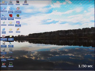
That persistence is what made CRTs usable. Phosphors in a cathode-ray tube glowed for around a millisecond, and the beam swept the whole screen in about 10 milliseconds at 100Hz. Without retinal persistence you would have seen a bright band a tenth of a screen wide crawling downwards. Photographing a CRT at short exposures shows exactly that.
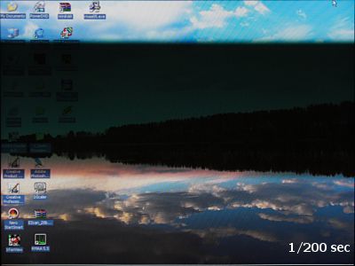
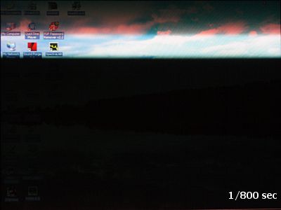
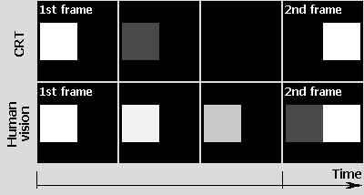
Consider a white square moving across a black background, one step per frame. On a CRT the square is drawn, begins to fade within about a millisecond, and has gone before the next frame arrives. The retina holds it for another 10 milliseconds or so, and by the time the second frame lands the after-image is already decaying.
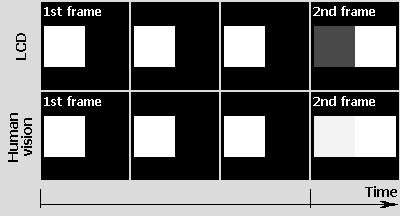
An active-matrix panel does not flicker. It holds the image for the entire interval between frames. That solves flicker completely, and it creates the blur problem, because the old frame is still being displayed right up to the moment the new one replaces it — and then the retina holds it for another 10 milliseconds on top.
Sample-and-hold is the real mechanism
This is now well characterized, and it is the single most useful thing to understand about display motion. Blur Busters describes sample-and-hold as frames being statically displayed until the next refresh, so that your eyes are in a different position at the start of a refresh than at the end, blurring the frame across your retinas.
Pixel speed and motion blur are separate parameters. Blur Busters states plainly that even instant 0ms pixel response can have lots of motion blur due to sample-and-hold. At 60Hz a frame is visible for the full 16.7ms regardless of whether the pixels transitioned in 1ms or 2ms — and it is that 16.7ms, not the transition, that sets the length of the blur trail.
This is why an OLED panel with a manufacturer-claimed transition time far below one millisecond still shows motion blur at 60Hz. The panel is not the limit; the hold time is. It also explains why a modestly specified 240Hz display can look dramatically cleaner in motion than a 60Hz panel with a better response-time figure.
The consequence for buying is direct. Blur Busters notes that the only way to reduce sample-and-hold blur is to shorten how long a frame is displayed — which leaves exactly two levers: raise the refresh rate, or blank the image between frames.
Black frame insertion and backlight strobing
If a CRT looks fast because it is black for most of the interval, the obvious fix is to make a hold-type panel go black too. BenQ implemented this as Black Frame Insertion, inserting extra black frames to emulate CRT behavior.
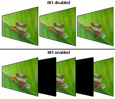
Drawing the black frame with the matrix itself only worked on fast panels. Slow VA transitions into black and out again took long enough that the black frame outlasted the frame interval, and the technique collapsed. The eye imposes its own limit too: if the black period is too long, the display simply flickers.
It is also not correct to say BFI doubles the frame rate. The panel’s own switching frequency rises with the inserted frames, but the number of unique image frames does not change at all, and nothing changes from the graphics card’s point of view.
The solution that stuck was to blank the backlight rather than the matrix. BenQ’s FP241WZ used 16 independently controlled backlight lamps, keeping 15 lit at any instant so a narrow dark band ran down the screen in sync with the refresh.
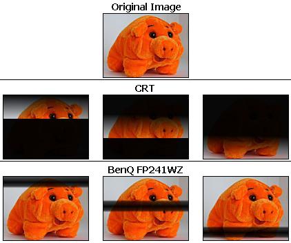
That approach is still the basis of every strobing implementation sold today, under names such as ULMB, ELMB and DyAc. Two of its original drawbacks also persist: brightness drops because the backlight is off part of the time, and strobing at low refresh rates is visible as flicker. This is why strobing modes usually require a high refresh rate to engage.
The other original prediction — that raising refresh rates would reduce blur by itself — turned out to be exactly right and is now the mainstream answer. Halving the frame interval halves the distance a moving object travels while a frame is held, and so halves the blur trail. That is the whole reason high-refresh panels look the way they do.
A high refresh rate only helps if the frames are unique. A display running at 240Hz fed 60 unique frames per second has 60Hz motion clarity. This applies to games, where the graphics card must actually sustain the frame rate, and to video, where the source is typically 24 to 30fps no matter what the panel can do.
GtG, MPRT and VESA ClearMR
Three different numbers now appear on spec sheets and they measure different things. GtG (gray-to-gray) is the pixel transition time. MPRT (Moving Picture Response Time) attempts to describe the perceived blur, and reflects hold time rather than transition speed.
Both are manufacturer-declared, and both are chosen from favorable transitions. The third number is an attempt to fix that. VESA’s ClearMR program certifies motion clarity independently, using a Clear Motion Ratio based on the ratio of clear pixels to blurry pixels, expressed as a percentage.
The tiers have already been extended upward to keep pace with the fastest panels. VESA added ClearMR 15000, 18000 and 21000 tiers for displays running at 480Hz and above. A ClearMR badge is more trustworthy than a manufacturer’s response-time claim, because the test method and the certification body are the same for every display carrying it.
Input Lag: How It Is Measured and How Much It Matters
Input lag is a different effect from blur, and the two are constantly confused. With blur, the frame is displayed immediately but takes time to resolve. With input lag, a delay — usually a whole number of refresh intervals — passes between the graphics card sending a frame and the display beginning to show it, because the frame is written into an internal buffer first.
The classic measurement method is straightforward: clone the output to two displays, run a millisecond timer, and photograph both screens repeatedly. The difference between the two timer readings is the lag. Single photographs are unreliable, because some will catch the instant a frame changes; the honest procedure is to take twenty or more and take the most frequent value.
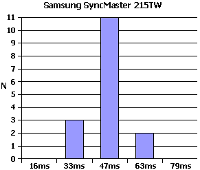
Modern review sites automate this with photodiodes and dedicated hardware rather than cameras, which is why published lag figures are now consistent between reviewers in a way they never were on forums.
Putting the numbers in human terms
Worst-case lag on desktop displays used to run to roughly three refresh intervals, around 47 milliseconds at 60Hz. Compare that with human reaction: the simple sensorimotor response — light appears, finger presses button — averages 200 to 250 milliseconds, which covers the eye registering the event, the brain identifying it and the command reaching the muscles.
For office work the lag is undetectable. For video it is also undetectable, because audio-video desynchronization only becomes visible at differences in the region of 200 to 300 milliseconds, and 47ms is barely longer than a single 24fps film frame.
Competitive gaming is where it can matter, and even there the effect is routinely overstated. Aiming and steering are learned motor patterns: the nervous system cannot fire on the instant the crosshair crosses a target, so it learns to fire early by a fixed amount. Change the lag and the brain re-learns the offset within a session — which is also why a player moving from a laggy display to a fast one often finds the new one feels wrong at first.
Most “input lag” complaints are something else. Moving from a smaller screen to a larger, higher-resolution one means the pointer must travel further for the same hand movement, which feels like sluggishness and is fixed in the mouse sensitivity settings. A graphics card that was comfortable at the old resolution and is not at the new one produces the same impression. Change one variable at a time before blaming the panel.
Auto-suggestion accounts for much of the rest. Pour the same beer into a cheap bottle and an expensive one and most people prefer the expensive one, which is why serious subjective comparisons are run blind. Someone who reads several forum pages about a display’s lag before going to look at it will generally see the lag.
Where lag genuinely warrants attention today is HDMI signal chains — televisions used as monitors, AV receivers in the path, and picture-processing modes left enabled. A TV’s Game Mode exists precisely to bypass that processing, and the difference between modes on the same set dwarfs the difference between two comparable monitors.
Contrast Ratio: Static, Dynamic and the HDR Tiers That Replaced Them
Static contrast ratio is the ratio of white luminance to black luminance, measured by the panel maker on a testbed at a defined backlight level. It is usually a property of the panel rather than of the finished monitor.
A finished monitor can be worse than its panel. Where brightness is regulated by the matrix rather than by the backlight, raising the brightness control lifts the black level and the black degenerates towards gray. Displays that dim by reducing backlight output do not have this problem.
A persistent myth deserves killing here: increasing backlight brightness does not improve contrast ratio. White and black rise by the same factor, so the ratio between them is unchanged.
Ambient light decides the contrast you actually get
The specified ratio is measured in darkness. Almost nobody works in darkness, and the light the screen reflects adds to its own black level.
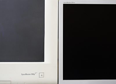
The physics behind this is still relevant to every emissive display. CRT phosphor is light gray in itself, so tinted glass was used to darken the screen; the phosphor’s own light passes that film once, while ambient light passes it twice and is attenuated far more. An LCD has no phosphor layer to reflect from — most incoming light enters the stack and is lost.
The practical rule survives the technology change: in a bright room, screen coating and reflectivity dominate perceived contrast; in a dark room, the panel’s black level dominates. OLED wins decisively in the dark room. In direct sunlight, panel type matters far less than surface treatment and peak brightness, which is the whole subject of using a laptop screen outdoors in sunlight.
Glossy coatings look better in a shop window for the same reason. A matte finish scatters incoming light in every direction; a glossy one reflects it in a single direction. If the light source is not behind you, glossy appears higher in contrast. If it is behind you, the glossy screen sends it into your eyes.
Dynamic contrast and what it is worth
Displays advertising contrast figures far above what their panels can do are quoting dynamic contrast. The mechanism is simple: dim the backlight in dark scenes and raise it in bright ones, since the eye judges overall brightness and does not scrutinize black level in a bright scene.
The advertised figure is arrived at by measuring white at maximum backlight and black at minimum backlight. A panel with 1000:1 static contrast whose electronics can vary the backlight threefold gets a 3000:1 dynamic figure — the two numbers are never available simultaneously.
Because the whole screen changes together, the mode fails on mixed content. A night street with bright street lamps has a dark average, so the backlight drops and the lamps dim with it. For desktop work it is not merely useless but distracting, and the first thing to turn off on a new display.
Local dimming is the version of this idea that works. Splitting the backlight into independently controlled zones lets dark and bright regions coexist, and mini-LED backlights push the zone count into the thousands. The failure mode is different rather than absent: too few zones produces a visible halo around bright objects on dark backgrounds.
VESA DisplayHDR tiers are the number worth reading
Because contrast and brightness claims are so easy to game, the useful figure is now a certification rather than a manufacturer number. VESA’s DisplayHDR specification (CTS 1.2) defines five tiers by peak luminance: DisplayHDR 400, 500, 600, 1000 and 1400, each also carrying black-level and color requirements.
There is a parallel ladder for emissive panels. The DisplayHDR True Black tiers hold a maximum black level of 0.0005 cd/m², against 0.4 down to 0.02 cd/m² on the standard tiers — a requirement essentially only OLED can meet. VESA added a True Black 1000 tier for professional video work on OLED.
DisplayHDR 400 is not really HDR. The entry tier requires 400 cd/m² peak and permits a black level of 0.4 cd/m² — which is roughly what a competent SDR display already does. A laptop or monitor advertising “HDR support” with no VESA tier at all is telling you only that it accepts an HDR signal, not that it can render one.
Color Reproduction: Gamut, Backlighting and Current Standards
The human eye responds to light between roughly 380 and 700nm. It carries one type of rod, which is highly sensitive but color-blind and gives us night vision, and three types of cone, each sensitive to a different band, which give color vision in reasonable light.
It might follow that color vision is fully described by three numbers. It is not. Experiments in the early twentieth century showed that if perception is described in red, green and blue coordinates, the eye can perceive colors requiring a negative red value — so the RGB model cannot describe human vision completely.
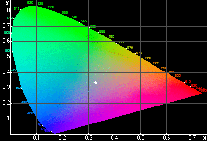
That work produced the CIE diagram, which encloses the full range of perceptible color. Any perceived color has an x and y coordinate on it. The white point marked at x=y=1/3 is the flat-spectrum point, and under normal conditions it looks distinctly cold and bluish — a reminder that “white” is a judgment, not a wavelength.
Because the eye does not care what spectrum produced a sensation, only how the receptors were excited, any color can be produced by mixing primaries. Plot three primaries on the diagram, connect them, and everything reachable lies inside that triangle. The triangle is the gamut.
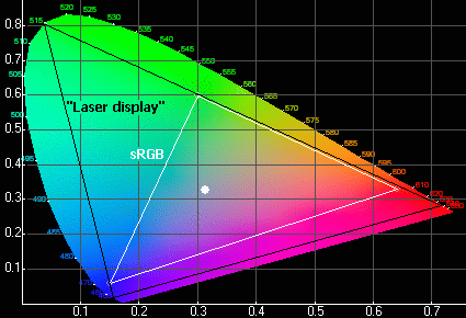
A laser display gives the largest possible three-primary gamut, because laser emission is nearly monochromatic and so sits on the diagram’s boundary. Even that does not cover everything the eye sees. Adding four or five primaries would help, which is the direction multi-primary research has taken, but three remains the commercial norm.
Why backlight spectrum determines gamut
An LCD’s color is subtractive at heart. White light from behind passes through red, green and blue filters, each cutting one band out of whatever the backlight emits. If the backlight emits energy where a filter is only partially opaque, that energy leaks through and contaminates the primary.
Cold-cathode fluorescent lamps, the original LCD backlight, are a bad source for this. A gas-discharge lamp produces a line spectrum with sharp peaks and gaps, unlike the smooth continuous spectrum described by Planck’s law that hot bodies such as the sun emit. The eye cannot tell the difference; the color filters absolutely can.
A worked example makes it concrete. A red sub-pixel filter peaks at 620nm, but the lamp phosphor has a strong peak at 575nm in the yellow, where the red filter still passes about a tenth of its maximum. The filter output is therefore 620nm at full strength plus 575nm at ten percent — not a monochromatic red, but red contaminated with yellow, which drags that vertex of the gamut triangle inwards.
For the original version of this analysis, that spectrum was measured directly on a laboratory monochromator rather than argued from theory.
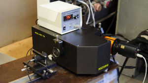
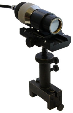
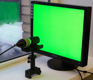
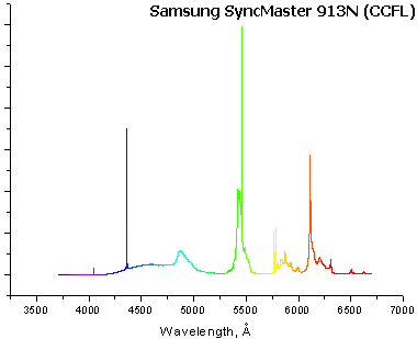
The junk between the three intended peaks is what pulls the gamut triangle towards the center of the CIE diagram. Replacing the lamp with narrow-band emitters removes it.
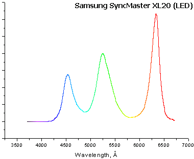
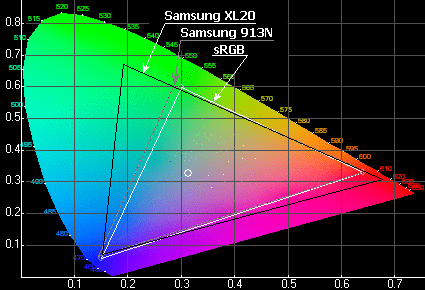
The prediction attached to these measurements was that better backlights would take mainstream displays past sRGB for the first time. That is exactly what happened, though not by the route expected. Three-color RGB LED backlights were expensive and largely died out; the technology that won was a blue LED with a quantum-dot conversion layer, which produces narrow, clean red and green peaks at commodity cost.
OLED sidesteps the problem altogether, because each sub-pixel emits its own light and there is no backlight spectrum to filter. That is also why OLED reaches the True Black contrast tiers that no backlit panel can.
sRGB, DCI-P3, Adobe RGB and why %NTSC is a bad number
Gamut is quoted as coverage of a reference space, and which reference is used changes the impression entirely. The relevant spaces today are sRGB, DCI-P3, Adobe RGB and Rec.2020, and DisplayMate’s comparison of display color gamuts from NTSC to Rec.2020 sets out how they relate.
- sRGB — the baseline for the web and general computing, and still the right target for anything published online
- DCI-P3 — the digital cinema space, wider than sRGB mainly in reds and greens, and the practical target for a good modern laptop or monitor
- Adobe RGB — extends further into cyan and green, and exists for print work rather than screen work
- Rec.2020 — the ultra-wide broadcast target, which no consumer display fully covers
Percentage-of-NTSC has been the marketing department’s favorite for decades because it flatters. NTSC is a 1953 television space that no current content uses, and its shape differs enough from sRGB that a display can score well against it while missing colors sRGB requires. A figure quoted only as %NTSC, with no sRGB or P3 number alongside, is worth discounting.
A wide gamut is also not automatically desirable. Content authored in sRGB and displayed on an uncorrected wide-gamut panel comes out oversaturated, which is why color management and a proper sRGB clamp mode matter more than the raw coverage figure for most people.
Color Temperature and Gray Balance
There is no absolute white. The brain adjusts its own white balance to the dominant lighting, exactly as a camera does, which is why an incandescent bulb looks faintly yellow indoors at night and thoroughly yellow if switched on in shade on a sunny day.
Color temperature describes a target white by the temperature an ideal blackbody would need to emit that color. The sun’s surface is around 6000K and daylight is defined accordingly; an incandescent filament runs near 2700K. Counter-intuitively, the higher the temperature the colder the light appears, because blue becomes dominant.
The concept strains for line-spectrum sources, whose emission cannot be compared directly with a continuous blackbody curve. For those, what matters is how the spectrum is perceived, which is why measuring instruments are built to respond as the eye does. This is a correlated color temperature rather than a true one.
Most displays offer three or four presets plus manual RGB gain controls. The goal of setting them is unglamorous: white on screen should look white under the light you actually work in, with no blue or red cast.
The parameter almost nobody checks
Color temperature frequently varies across brightness levels on the same display. Gray differs from white only in brightness, so this is really gray balance — and on many panels the balance measured on a light gray differs from the balance measured on a dark one.
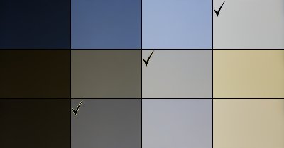
No arrangement of the on-screen menu fixes this. Correcting it requires a hardware colorimeter building a profile that maps the panel’s actual behavior at each level, which is why a review that publishes measured color temperature at several gray levels tells you something the summary figure cannot.
Setting Up a Monitor and Your Workspace
Most complaints about a new display are setup problems rather than hardware problems, and they follow a predictable order.
Position and lighting
Sit at roughly arm’s length, further for a large screen. Set the height so the top edge of the panel is around eye level, which directs the gaze slightly downwards and keeps the eyelids partly covering the eyes — useful, because people blink much less than usual while working.
If a stand has no height adjustment, almost every monitor accepts a standard VESA mount, and an arm gives complete freedom over height, depth and angle. That flexibility is also what makes a monitor a real upgrade over a laptop screen alone, whether you add one display or run a laptop with two external monitors.
Do not work in a dark room. Repeatedly moving between a bright screen and a black surround tires the eyes. Ambient light also needs to be steady — old fluorescent fittings with magnetic ballasts flicker at twice the mains frequency and can beat against a display’s own refresh unpleasantly. Modern electronic-ballast and LED lighting avoids it.
Resolution, refresh rate and connection
A fixed-pixel display has exactly one native resolution and looks worse at every other. Set it and leave it. If the interface is then too small, scaling in the operating system is the right tool — both Windows and macOS handle fractional scaling far better than they did a decade ago.
The old advice that displays only really run at 60Hz no matter what they advertise is thoroughly dead, and so is the analog-versus-digital input question. What replaced both is a bandwidth question: high resolution at a high refresh rate needs enough of it, and a cable or port that cannot supply it will silently drop you to a lower refresh rate or apply compression. Check what the display is actually running at in the display settings after connecting, rather than assuming.
On a laptop this is worth checking twice, because the port you use determines the bandwidth available — a USB-C connection carrying DisplayPort Alt Mode may share lanes with data. This also affects behavior when the lid is shut, which is covered in our guide to keeping an external monitor on with the laptop closed.
Brightness is almost always set too high
Displays ship bright, because bright sells in a showroom. That level suits daylight and film, and is too much for an office. There is a reliable trick for finding the right setting: put a sheet of white paper next to the screen and adjust until on-screen white matches the paper. It only works if the room itself is properly lit.
Change settings gradually and give your eyes time between adjustments. Someone moving from a dull old display will find a correctly set new one harsh at first — and then find the old one unbearable a month later. Do not chase “exactly like the old monitor”.
Long forum threads listing displays that supposedly do not strain the eyes largely describe badly configured displays. The one hardware factor with a genuine basis is backlight PWM flicker: some panels dim by pulsing the backlight, and a minority of people are sensitive to it. If that describes you, look for a display specified as flicker-free or using DC dimming.
Is a 1ms response time actually better than 4ms?
Rarely by as much as the numbers suggest. Gray-to-gray figures are manufacturer-declared and taken from favorable transitions, and pixel transition speed is not what sets visible motion blur. Blur Busters points out that even a 0ms panel blurs under sample-and-hold, because at 60Hz each frame is held for 16.7ms regardless. Refresh rate and strobing change motion clarity far more than the last few tenths of a millisecond.
What is the difference between GtG and MPRT?
GtG measures how long a pixel takes to change from one gray level to another. MPRT attempts to describe how long a frame is visible, and therefore how much eye-tracking blur it produces. They can differ by an order of magnitude on the same display. VESA’s ClearMR certification is the independent alternative to both, scoring the ratio of clear to blurry pixels.
Does input lag matter for anything other than competitive gaming?
Not really. Worst-case desktop monitor lag has historically been around three frames, or 47ms at 60Hz, against an average human simple reaction time of 200 to 250ms. Audio-video desynchronization only becomes noticeable at 200 to 300ms. Where lag genuinely bites is televisions used as monitors with picture processing enabled — turning on Game Mode usually resolves it.
Is DisplayHDR 400 worth paying for?
It is close to meaningless as an HDR badge. The tier requires 400 cd/m² peak brightness and allows a black level of 0.4 cd/m², which a good SDR display already achieves. Meaningful HDR starts around DisplayHDR 600 with local dimming, or at any of the DisplayHDR True Black tiers, which demand a black level of 0.0005 cd/m² and in practice mean OLED.
Why does my monitor’s contrast look worse than the specification says?
The specified figure is measured in darkness, and ambient light reflected off the screen adds directly to the black level. In a bright room, screen coating and reflectivity determine perceived contrast far more than the panel’s rated ratio. Raising the backlight does not help, because white and black rise together and the ratio is unchanged.
Should I choose a display with a wider color gamut?
Only if you can manage it. A wide-gamut panel showing sRGB content without color management or an sRGB clamp mode produces oversaturated color. DCI-P3 coverage is the useful figure for a good modern display and Adobe RGB matters for print work. Treat a coverage figure quoted only as a percentage of NTSC with suspicion — NTSC is a 1953 television space that no current content uses.
Why do colors shift between light and dark areas of my screen?
That is gray balance error, and it is common. Color temperature on many panels varies with brightness level, so the white balance measured on a light gray differs from the balance on a dark one. The on-screen menu cannot fix it — correcting it needs a hardware colorimeter to build a profile of the panel’s actual behavior at each level.
Does dynamic contrast do anything useful?
For film, sometimes. For desktop work it is actively distracting, because the whole backlight changes at once and the screen brightness shifts as you switch windows. It also fails on mixed scenes such as a dark street with bright lamps. Local dimming with many zones is the version of the idea that genuinely works; mini-LED backlights push the zone count into the thousands.
Final Thoughts on Reading Monitor Specifications
The hardware in this article has been replaced twice over, but the reasoning has not: every declared parameter is measured under conditions chosen by whoever published it, and the last stage of the signal chain is always a human visual system with its own limits.
Independent certification is the practical answer to that. A VESA DisplayHDR or ClearMR tier is tested the same way for every display carrying it, which is more than can be said for any response time or contrast figure on a box.